How to make your online store “look expensive”
I had a student ask me how they can make their site look more “expensive”
That resonated with me for some reason.
It’s an interesting lens to look at a website through.
This merchant has an amazing product that people love,
They have incredible photography and graphic assets,
They email their list almost daily,
But they were right.
The website looked cheap (for lack of a better word).
The hero images were small and pixellated,
The logo was way too big and had an outdated feel to it,
Their collections had a mishmash of lifestyle photos and ones with white backgrounds.
And they were all different sizes.
These were just a few of the things that were wrong,
But it got me thinking …
What DOES make a website look “expensive.”
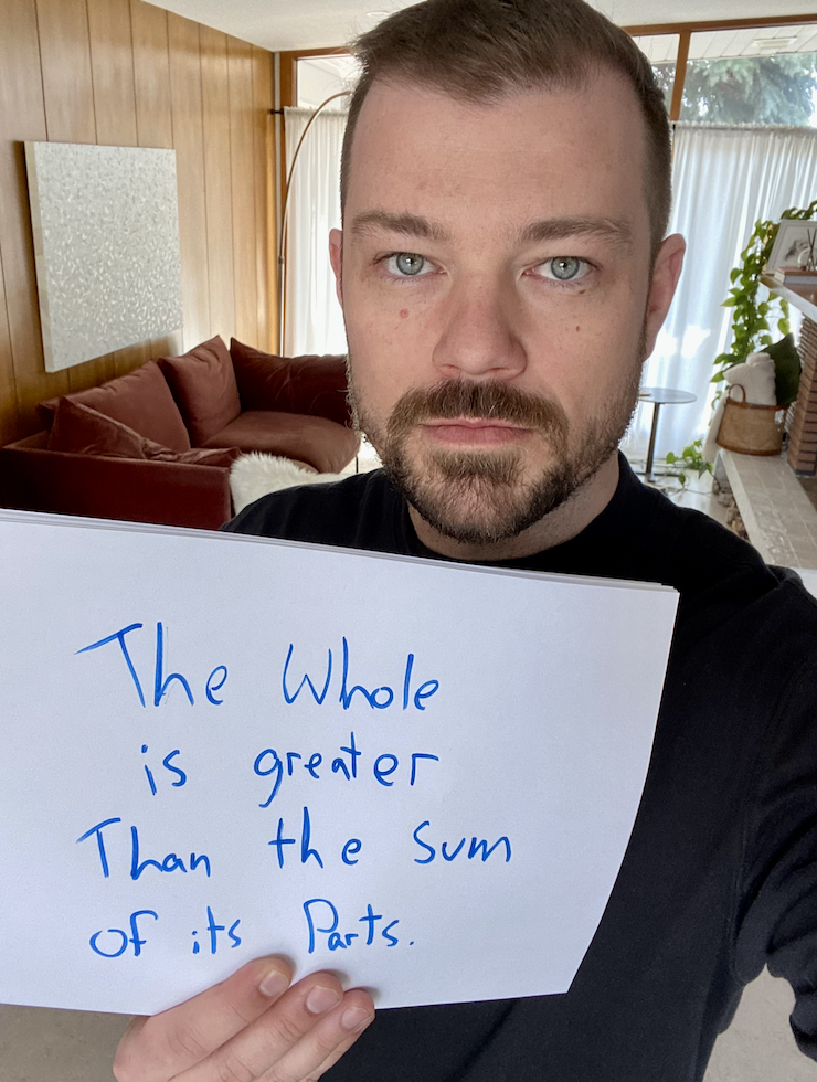
The answer might disappoint you.
THE WHOLE IS GREATER THAN THE SUM OF ITS PARTS.
In other words: The devil is in the details.
What I mean by this is that there is beauty in simplicity,
But that is not easy to achieve.
Every aspect of your site needs to add to the experience.
If you were shopping along a trendy street in your city,
And came across a store that had dirty windows and a sign with half of its lightbulbs burnt out,
Would you go in?
If you did go in and their merchandise was cluttered on the shelves,
There was a filthy mop-bucket in the middle of the aisle,
And the cashier looked and smelled like they hadn’t showered in a week,
Would you load up your cart and make a big purchase?
If it was something I desperately needed, I would buy it, leave, and never come back.
The point is that your store needs to guide the emotions of your visitors.
You first have to make sure they know they are in the right place and that they are comfortable,
Then you have to strengthen their trust,
Then present them with an offer that they’re thrilledto take.
Stay tuned in because I’ll be talking about the thousands of tactics that go into the concepts above,
But first, I want to show you something.
We recently completed a Theme Refresh for a client.
We used the same images, same copy, same everything …
But the new theme gave the store a ton more credibility.
It felt more … how should I say? Expensive.
Here’s what happened the following month: